.jpg)
UI Images Best Practices
September 2, 2021 - Reading time: 172 minutes
10 best practices to help you master images in UI design.
Imagery is one of the most effective tools to grab the reader's attention.
Images are used for setting up the brand's voice and building its presence. A well-placed photo can tell about your business much more than hundreds of words on your landing page.
But searching and fitting images into your designs can be really challenging. Besides finding the right photo, you'll need to properly align it with other interface elements and your business goals.
So here are my best practices to keep in mind while working with interface images.
Be extremely picky when choosing photos
A bad photo can instantly ruin your design, even if the rest of the work is perfect.
When choosing photos, use only relevant, professional, and high-quality photos. Thanks to the internet, we have tons of resources and tools to provide us, both paid stock photos and royalty-free content.
Here is a handy list of resources to help you find the right photo right within your fingertips:
- Unsplash plugin for Figma — Quickly Insert images from Unsplash straight into your designs.
- Photos plugin for Figma — Search and insert photos and gifs from Unsplash, Google, Flickr, Pexels, Giphy, and other sources.
- Avatar plugin for Figma — Generate random avatars in Figma.
- Unsplash plugin for Sketch — Insert photos from Unsplash.
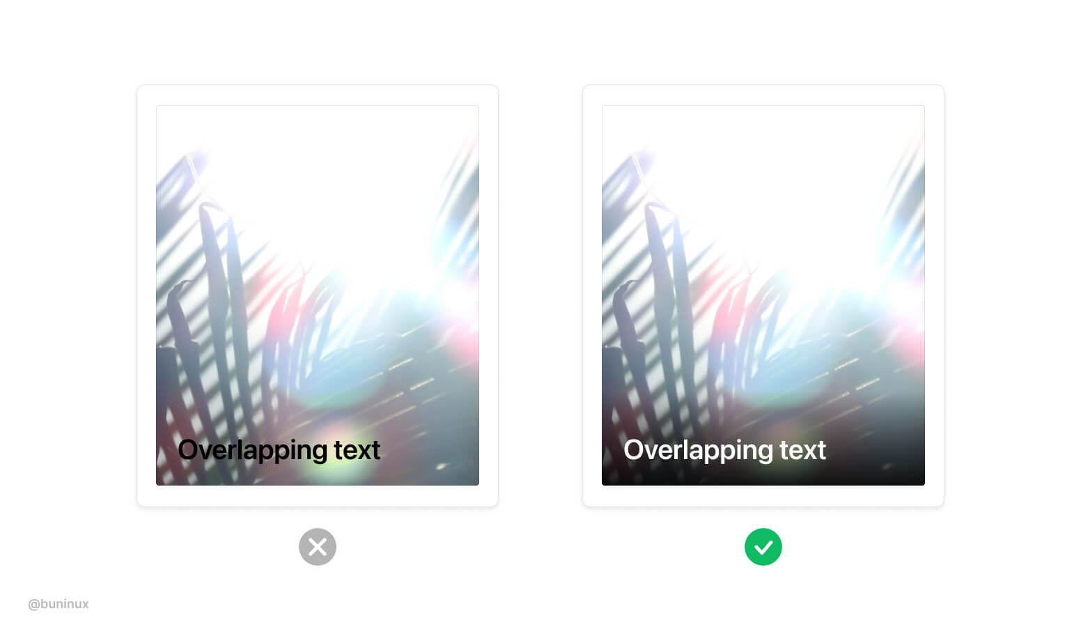
Ensure text has enough contrast
Bright and colorful photos can make text unreadable. When placing text above your images, make sure to emphasize the copy by adjusting image contrast or adding a darker color overlay.
Make images stand out
With multiple images on a screen, make some to lead the pack.
Use images to articulate the importance of your layout elements. Attract users to certain areas or CTA by employing bolder/bigger images.
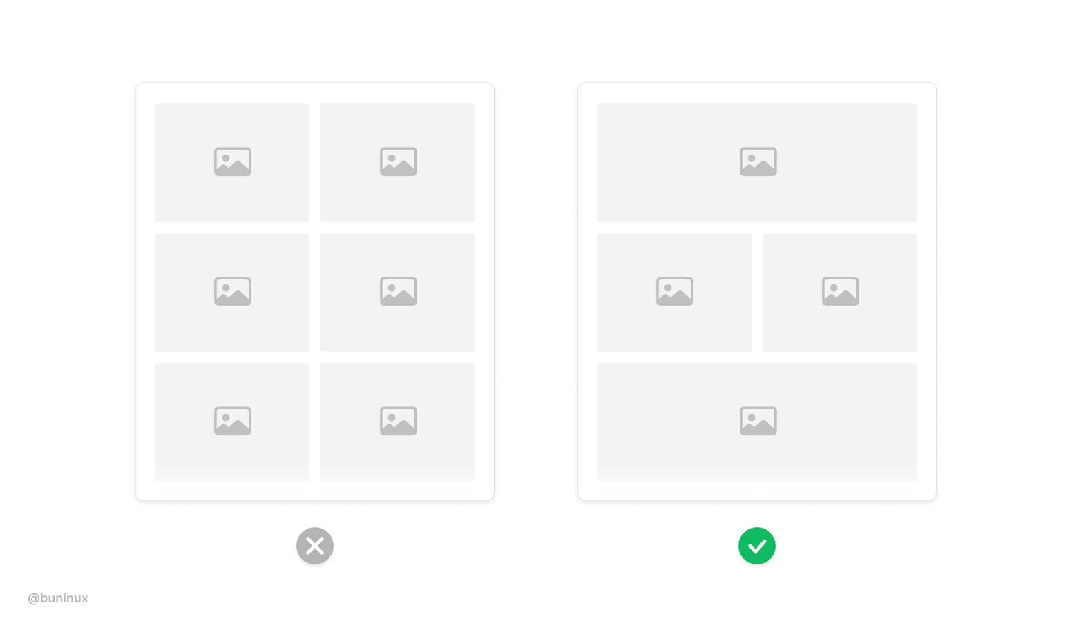
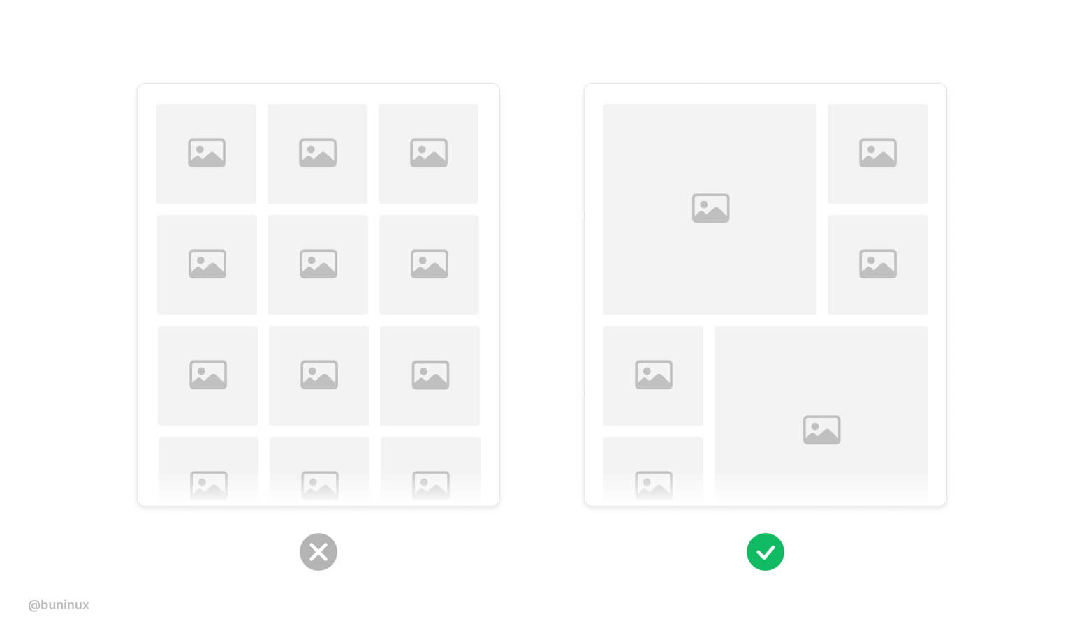
Add dynamic to the layout
When designing a large gallery, especially on mobile screens. Employ multiple columns and image sizes to make scrolling more fun and interactive.
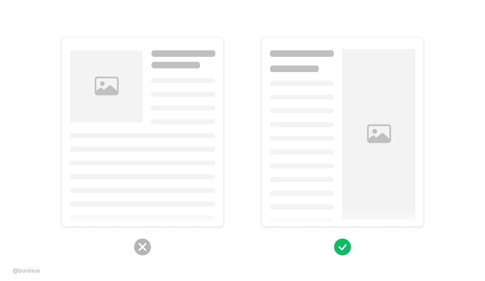
Use text wrapping smartly
Avoid nesting images into paragraphs.
When an image interrupts the text, it causes the reader to make unnecessary eye jumps from side to side of your page. Avoid interrupting the reading flow. Align images inside a paragraph to the top or right.
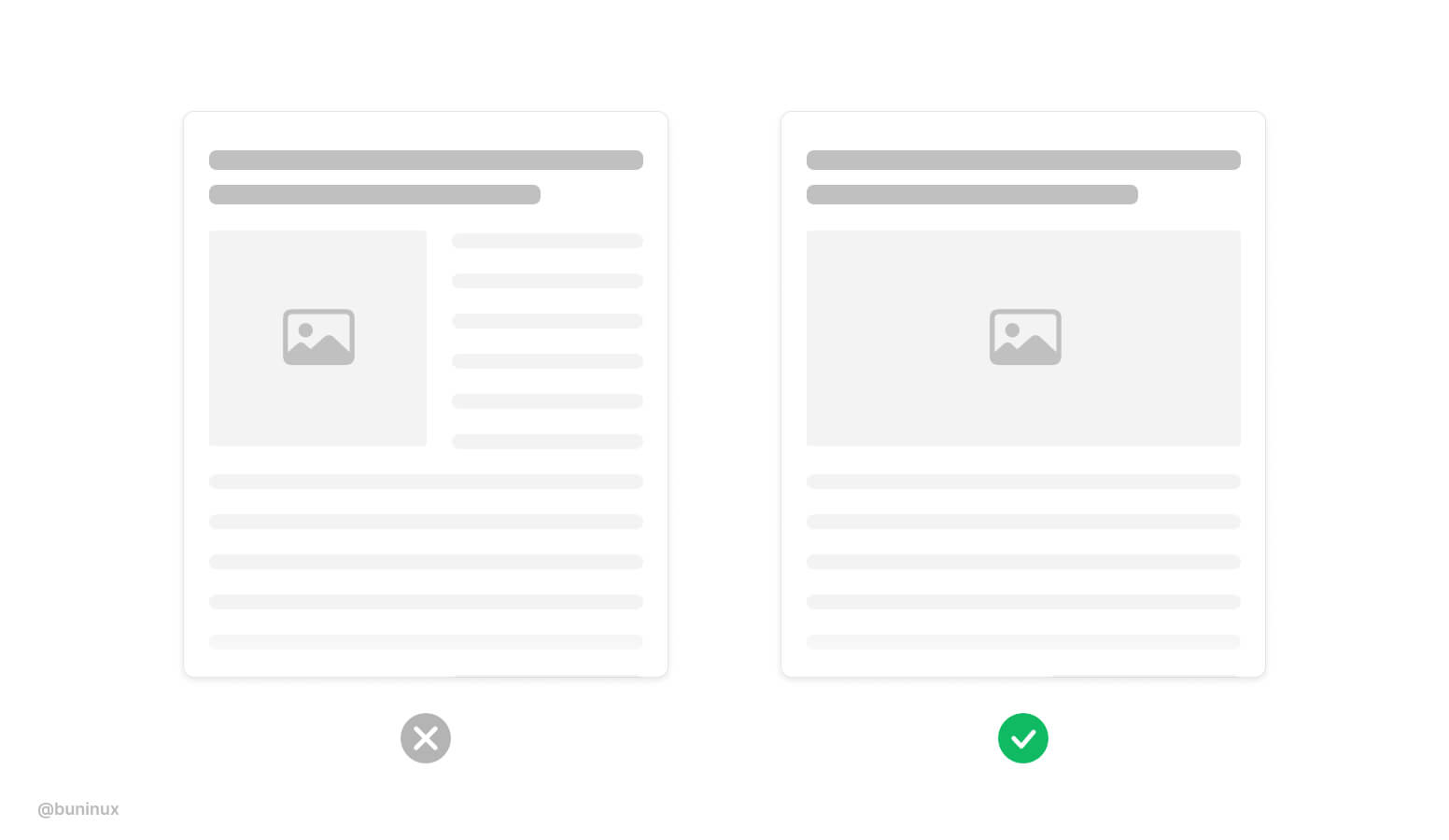
Separate text and images into columns
Instead of wrapping text, sometimes it's a good idea to split the view into separate columns. Also, this duo column layout is a good way to demo vertical photos.
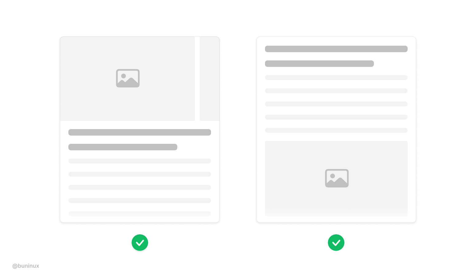
Put images outside the layout
Put images and multi-image galleries outside the grid.
Use this trick to employ a more immersive feel for your page or article. Placing full-size photos also make a clear visual pause for your readers.
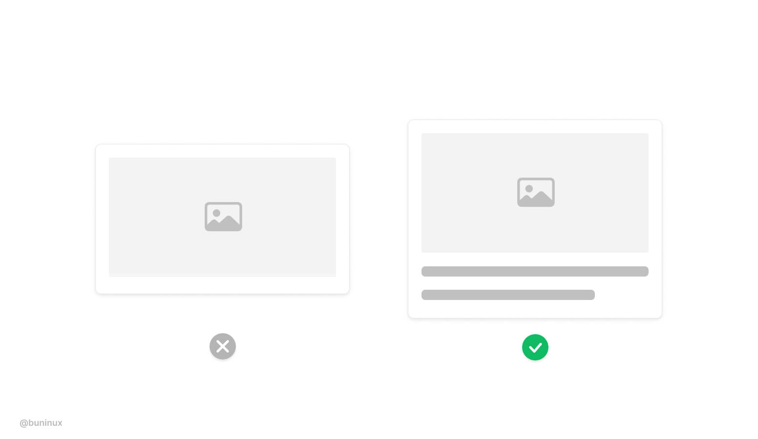
Use captions for standalone images
When an image is placed without a proper caption, it makes no sense, and the overall UI accessibility suffers. Always provide <alt> tags and a proper description of images. Google ranks such behavior higher.
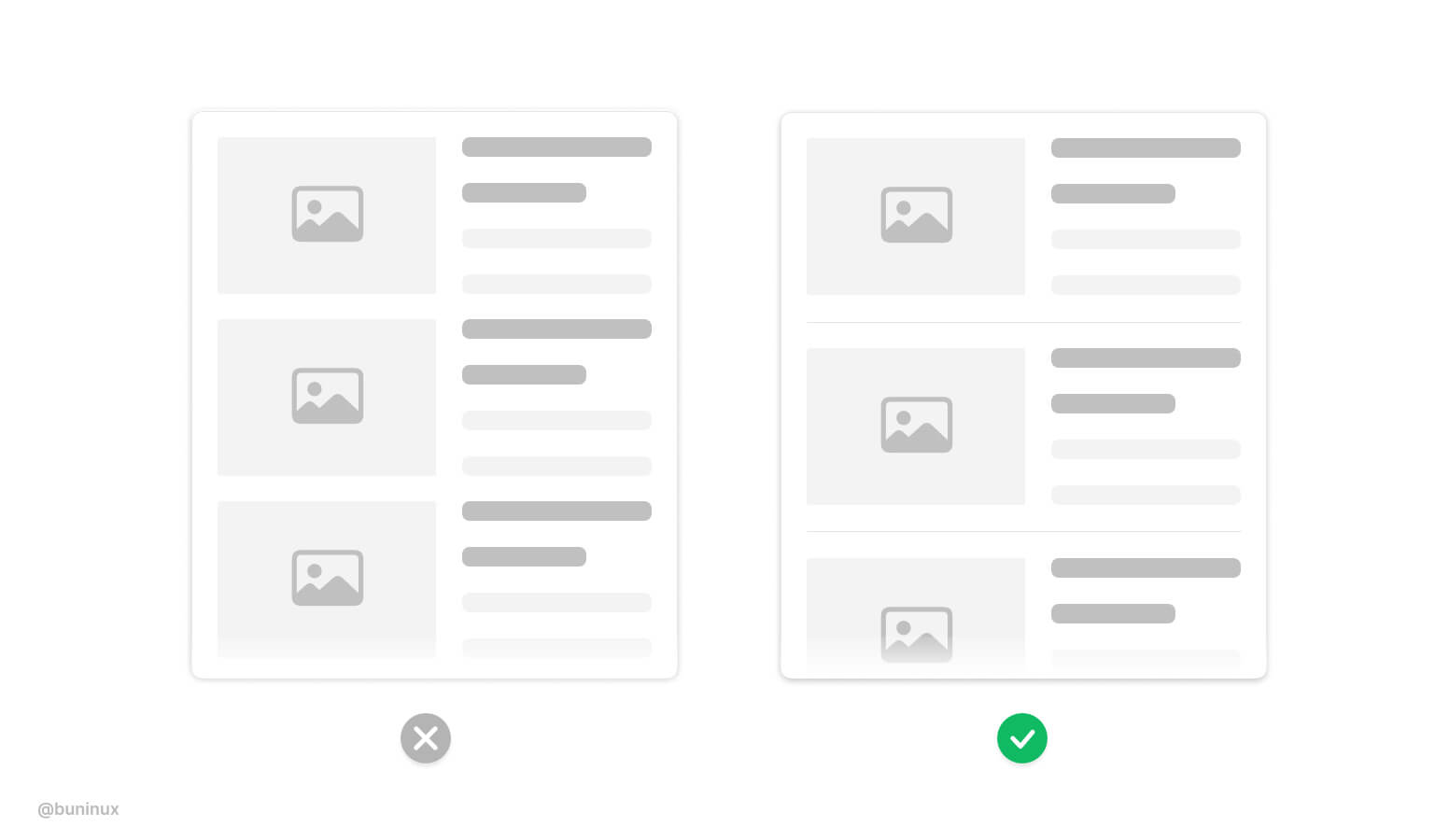
Separate visually heavy blocks
Heavy vertical blocks can blend. Consider adding a separator <hr> tag between such elements.
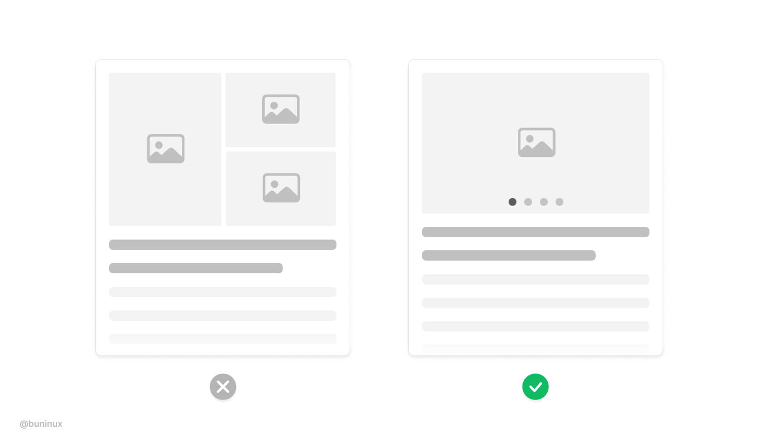
Use pagination to showcase multiple images
Consider employing mobile-friendly horizontal pagination to let users see your product or service with a swipe gesture. People love to swipe.
---
Thanks for the read! 🙌
If you enjoyed this article, feel free to subscribe and share these tips with others!